


I took a deep breath and double clicked. Too my great delight I was immediately drawn to what was before me. She gets it, I thought, she gets it.
Dr. Rupe and I talked tonight and I think we're pretty much on the same page about our favorites and the tweaks we'd like to make. We wanted to make sure and get your input as our friends and early adopters of this project. I happen to know that many of you have really great taste so I'm dying to know what you women and mommies out there think.
Please, please, please take a few minutes to post a comment and let us know which of these three covers if your favorite. Let us know what you like and don't like and what you would change.
Thanks for taking the time to give us your opinion. We believe this book is for a large number of women {God please, may a large number of women buy this book : )} so the more input the better. Feel free to share the link with your girlfriends.
We're anticipating a lot of fun over the next few months as we finish the book. We appreciate your continued prayers.
Love,

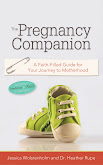
{Please note: None of these covers have a white border around them. Blogger is just posting them that way so you can ignore it.}
TPC Comp 1

TPC Comp 2

TPC Comp 3


Hey Dr. Rupe!
ReplyDeleteI am posting a comment for both my husband Jeff (the video/graphics professional) and myself (the mom/book reader)! most of this though, his words!
Fav is #2. Most gender neutral, grabs your attention, modern, you know what it is when you look at it, looks new and fresh and clean.
next #1. Initially my fav, but then after talking with Jeff he changed my mind :) love the colors, polka dots, and safety pin detail, but it takes a minute to realize it's a belly. Jeff thinks it may be too complicated.
#3. seems to plain, just like any other pregnancy book out there, does not grab attention and seems very feminine.
Hope these comments help - I want you to sell this book to a large number of women too! Good luck picking! I think you have some great options.
My favorite is #1, although after reading the previous comments, I wonder if it might be different from a guy's perspective. But, I guess he won't be the main purchaser of the book.
ReplyDeleteI think I like #1 because of the color scheme, and because I don't prefer bare pregnant bellies in pictures/book covers/etc.
On #2 I do like how the title is at the very top- I think that may be more eye-catching than #1.
I am not really a fan of #3 either.
Very exciting!!
I like #2 - clean and simple yet wouldn't blend in too much with other pregnancy books (not that I'm an expert on that by any means). I like the colors, the font and especially the photo. The little shoes are cool because they represent the "journey". The only thing I'm a little iffy on that one is how they've positioned your names. I get that if they put them at the bottom, it would cover up the hand, but having them off to the side makes them less noticeable. Hmmm...
ReplyDeleteI like #2 the best - clean, modern, love the green and the title at the top. Of the three comps I would be LEAST likely to pick #3 up off the shelf. good luck!
ReplyDelete#2 is the cleanest looking and the most appealing- the one I would most likely buy just by looking at the covers. I like the colors of #1 and how the shoes are "walking". Def not #3.
ReplyDeleteMy vote is #2.
ReplyDelete#2 or #1 with a few tweaks - I really like the color scheme of #1.
ReplyDeleteBut #2 is great just the way it is!
I'm a fan of #2!
ReplyDeleteI actually really like #1. I like the safety pin detail, the itty bitty shoes (and I like that they are walking over the hump, reaching the other side), and I like that it has a modern look. I also like #2. My eye quickly goes to that one when these books are lined up - I think because the title shows very well and it is very clean. I think #3 would get lost in the shuffle - many books out like that cover. My fav is #1 :-)
ReplyDelete